
Latest News

THE SHOWROOM IS DEAD: CHOOSING TRUE COMFORT AND AUTHENTICITY
Monday, 20 July 2026 - 10:27 | Views - 185
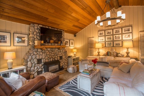
For years, home decor leaned heavily into crisp, ultra-minimalist aesthetics. Spaces were styled to look like pristine galleries—curated to perfection, but often cold and sterile. The recent cultural shift, however, moves squarely toward lived-in luxury, emotional comfort, and personal expression.
People no longer want homes that look like catalog showrooms; they want spaces that feel like a refuge. Today’s design philosophy embraces:
-Curated Storytelling: Integrating vintage finds, worn leather, heirloom pieces, and personal mementos that reflect who lives there rather than matching a pre-packaged look.
-Tactile Comfort: Layering touchable materials like bouclé, linen, distressed wood, and slubbed wool to create an inviting, sensory experience.
-Softened Architecture: Swapping sharp, rigid lines for curved furniture, arched doorways, and organic silhouettes that ease visual tension.
-Moving Beyond Stark White: The Rise of Oatmeal & Taupe.
One of the biggest transformations in modern decor is the shift away from stark, sterile whites and cool "millennial greys". While bright white was long favored for making spaces look larger, it often creates harsh shadows and feels clinical under modern LED lighting, Instead, designers are turning to warm, nuanced undertones like oatmeal and taupe to establish depth, warmth, and tranquility.
-Why Oatmeal Works!
Oatmeal sits right between soft cream and natural linen. It carries tiny specks of yellow, grey, and brown undertones, capturing light without reflecting it harshly.
-The Vibe: Airy yet grounded, organic, and effortlessly cozy.
-Best Paired With: Woven jute rugs, natural timber, matte ceramics, and soft brass fixtures.
-Why Taupe Works!
Taupe bridges the gap between warm brown and cool grey. Because it is an naturally earthy shade, it adapts smoothly to changing sunlight throughout the day.
-The Vibe: Sophisticated, cocooning, and quietly opulent ("quiet luxury").
-Best Paired With: Rich walnut furniture, deep espresso accents, bronze hardware, and moody textile layering.
-Layering the New Palette.
Using oatmeal and taupe isn't about creating a monochromatic tan box; it’s about tonal depth. Because these warm neutrals share earthy foundations, they allow you to mix patterns, textures, and dark contrast accents effortlessly.
Design Tip: To keep an oatmeal or taupe space from feeling flat, ensure every room incorporates at least three distinct textures (e.g., matte lime-wash walls, a high-pile rug, and raw wood elements) along with a touch of dark contrast (like deep charcoal, rust, or olive).
The end result is an interior that feels intentional, deeply comfortable, and tailored to real living rather than just staging.
People no longer want homes that look like catalog showrooms; they want spaces that feel like a refuge. Today’s design philosophy embraces:
-Curated Storytelling: Integrating vintage finds, worn leather, heirloom pieces, and personal mementos that reflect who lives there rather than matching a pre-packaged look.
-Tactile Comfort: Layering touchable materials like bouclé, linen, distressed wood, and slubbed wool to create an inviting, sensory experience.
-Softened Architecture: Swapping sharp, rigid lines for curved furniture, arched doorways, and organic silhouettes that ease visual tension.
-Moving Beyond Stark White: The Rise of Oatmeal & Taupe.
One of the biggest transformations in modern decor is the shift away from stark, sterile whites and cool "millennial greys". While bright white was long favored for making spaces look larger, it often creates harsh shadows and feels clinical under modern LED lighting, Instead, designers are turning to warm, nuanced undertones like oatmeal and taupe to establish depth, warmth, and tranquility.
-Why Oatmeal Works!
Oatmeal sits right between soft cream and natural linen. It carries tiny specks of yellow, grey, and brown undertones, capturing light without reflecting it harshly.
-The Vibe: Airy yet grounded, organic, and effortlessly cozy.
-Best Paired With: Woven jute rugs, natural timber, matte ceramics, and soft brass fixtures.
-Why Taupe Works!
Taupe bridges the gap between warm brown and cool grey. Because it is an naturally earthy shade, it adapts smoothly to changing sunlight throughout the day.
-The Vibe: Sophisticated, cocooning, and quietly opulent ("quiet luxury").
-Best Paired With: Rich walnut furniture, deep espresso accents, bronze hardware, and moody textile layering.
-Layering the New Palette.
Using oatmeal and taupe isn't about creating a monochromatic tan box; it’s about tonal depth. Because these warm neutrals share earthy foundations, they allow you to mix patterns, textures, and dark contrast accents effortlessly.
Design Tip: To keep an oatmeal or taupe space from feeling flat, ensure every room incorporates at least three distinct textures (e.g., matte lime-wash walls, a high-pile rug, and raw wood elements) along with a touch of dark contrast (like deep charcoal, rust, or olive).
The end result is an interior that feels intentional, deeply comfortable, and tailored to real living rather than just staging.







Monday, 12 October 2026 - 12:07
Paris Fashion Week SS27 has officially declared minimalism over, ushering in a breathtaking era of high-impact...

Monday, 05 October 2026 - 11:00
Paris Fashion Week has been nothing short of a whirlwind, turning the French capital into the ultimate...

Tuesday, 29 September 2026 - 13:08
In the world of fashion, true icons are defined not by fleeting trends, but by an unwavering, uncompromising...



Thursday, 15 October 2026

Wednesday, 07 October 2026

Thursday, 01 October 2026

Friday, 16 October 2026
Wednesday, 07 October 2026
Thursday, 01 October 2026

Tuesday, 18 August 2026