
Latest News

Why Faded Pastels and Mint Green Work
Saturday, 07 November 2026 - 18:48 | Views - 125
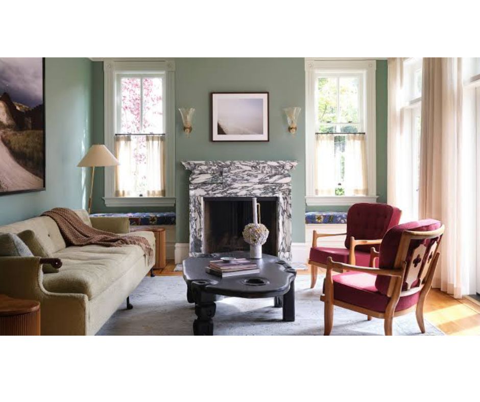
As the bright energy of spring and summer fades into cooler, cozier seasons, interior trends shift away from high-contrast brightness toward muted, restorative palettes. Among this evolving design landscape, faded seasonal pastels—anchored by soft, botanical mint green—have emerged as a sophisticated bridge between seasons.
Rather than packing away summer’s breezy hues when the air turns crisp, designers are softening them, blending dusty pastels with grounded neutrals to create spaces that feel timeless, serene, and effortlessly cozy year-round.
Why Faded Pastels and Mint Green Work
Standard pastels can sometimes feel overly candy-coated or strictly seasonal. However, faded pastels—hues infused with gray, beige, or smoky undertones—bring an understated elegance to living spaces.
Mint green acts as the perfect anchor in this palette:
Natural Tranquility: It carries the organic freshness of greenery indoors without overwhelming small rooms.
Versatile Neutral Base: When desaturated, mint green functions almost like a neutral, pairing seamlessly with light oak, brass, matte black, and rich cream.
Seasonal Adaptability: In warmer months, mint feels cool and refreshing; as autumn and winter arrive, pairing it with warm textures like bouclé, chunky knits, and walnut wood turns it cozy and inviting.
How to Style the Palette Room-by-Room
1. The Living Room: Layering Textures & Undertones
Keep walls neutral—such as a warm alabaster or chalky ivory—and use faded mint as your primary soft furnish color.
Furniture: A faded mint linen sofa or accent armchairs create a calm focal point.
Layering: Pair mint with faded dusty rose, washed lavender, or muted buttercream throw blankets and pillows.
Accent Metals: Introduce brushed antique brass or warm bronze hardware to balance the cool green notes with visual warmth.
2. The Bedroom: A Restorative Oasis
Because mint green lowers visual noise and promotes calm, it excels in sleeping quarters.
Bedding: Choose washed-linen bedding in faded mint paired with oatmeal or dusty sage sheets.
Walls: Consider a muted mint accent wall behind the bed using a matte or limewash finish to introduce subtle texture.
Lighting: Warm-toned light bulbs (2700K) prevent mint from looking medicinal or stark at night.
3. Kitchen & Dining: Vintage Charm Meets Modern Clean
Muted mint green cabinetry is a timeless alternative to classic white or dark navy.
Cabinetry: Opt for low-sheen mint paint on lower cabinets while keeping upper walls or open shelving bright white.
Table Settings: Mix faded pastel ceramic dishware—dusty peach, soft sky blue, and muted mint—on a natural wood dining table for an inviting, artisanal feel.
Color Pairings That Elevate Mint Green
Base Color Complementary Accent Visual Effect Best For
Faded Mint Warm Ochre / Terracotta Earthy, balanced, and grounded Living rooms & dining areas
Faded Mint Dusty Blush & Cream Romantic, soft, and airy Bedrooms & reading nooks
Faded Mint Charcoal Gray & Matte Black Crisp, modern, and structured Kitchens & home offices
Faded Mint Raw Walnut & Brass Mid-century, organic, and elevated Entryways & accent walls
Easy Ways to Refresh Your Space Today
If you aren't ready to repaint or buy major furniture pieces, you can easily incorporate this trend through small, high-impact decor swaps:
Washed Linen Pillows: Swap out vibrant cushion covers for faded mint, muted peach, and heathered gray covers.
Ceramics & Vases: Display matte clay or frosted glass vases filled with dried eucalyptus or neutral pampas grass.
Botanical Artwork: Hang framed vintage botanical prints featuring desaturated green leaves and muted floral hues.
Textured Area Rugs: Select a faded, vintage-style Persian rug that weaves mint green with warm beige and cream tones.
Rather than packing away summer’s breezy hues when the air turns crisp, designers are softening them, blending dusty pastels with grounded neutrals to create spaces that feel timeless, serene, and effortlessly cozy year-round.
Why Faded Pastels and Mint Green Work
Standard pastels can sometimes feel overly candy-coated or strictly seasonal. However, faded pastels—hues infused with gray, beige, or smoky undertones—bring an understated elegance to living spaces.
Mint green acts as the perfect anchor in this palette:
Natural Tranquility: It carries the organic freshness of greenery indoors without overwhelming small rooms.
Versatile Neutral Base: When desaturated, mint green functions almost like a neutral, pairing seamlessly with light oak, brass, matte black, and rich cream.
Seasonal Adaptability: In warmer months, mint feels cool and refreshing; as autumn and winter arrive, pairing it with warm textures like bouclé, chunky knits, and walnut wood turns it cozy and inviting.
How to Style the Palette Room-by-Room
1. The Living Room: Layering Textures & Undertones
Keep walls neutral—such as a warm alabaster or chalky ivory—and use faded mint as your primary soft furnish color.
Furniture: A faded mint linen sofa or accent armchairs create a calm focal point.
Layering: Pair mint with faded dusty rose, washed lavender, or muted buttercream throw blankets and pillows.
Accent Metals: Introduce brushed antique brass or warm bronze hardware to balance the cool green notes with visual warmth.
2. The Bedroom: A Restorative Oasis
Because mint green lowers visual noise and promotes calm, it excels in sleeping quarters.
Bedding: Choose washed-linen bedding in faded mint paired with oatmeal or dusty sage sheets.
Walls: Consider a muted mint accent wall behind the bed using a matte or limewash finish to introduce subtle texture.
Lighting: Warm-toned light bulbs (2700K) prevent mint from looking medicinal or stark at night.
3. Kitchen & Dining: Vintage Charm Meets Modern Clean
Muted mint green cabinetry is a timeless alternative to classic white or dark navy.
Cabinetry: Opt for low-sheen mint paint on lower cabinets while keeping upper walls or open shelving bright white.
Table Settings: Mix faded pastel ceramic dishware—dusty peach, soft sky blue, and muted mint—on a natural wood dining table for an inviting, artisanal feel.
Color Pairings That Elevate Mint Green
Base Color Complementary Accent Visual Effect Best For
Faded Mint Warm Ochre / Terracotta Earthy, balanced, and grounded Living rooms & dining areas
Faded Mint Dusty Blush & Cream Romantic, soft, and airy Bedrooms & reading nooks
Faded Mint Charcoal Gray & Matte Black Crisp, modern, and structured Kitchens & home offices
Faded Mint Raw Walnut & Brass Mid-century, organic, and elevated Entryways & accent walls
Easy Ways to Refresh Your Space Today
If you aren't ready to repaint or buy major furniture pieces, you can easily incorporate this trend through small, high-impact decor swaps:
Washed Linen Pillows: Swap out vibrant cushion covers for faded mint, muted peach, and heathered gray covers.
Ceramics & Vases: Display matte clay or frosted glass vases filled with dried eucalyptus or neutral pampas grass.
Botanical Artwork: Hang framed vintage botanical prints featuring desaturated green leaves and muted floral hues.
Textured Area Rugs: Select a faded, vintage-style Persian rug that weaves mint green with warm beige and cream tones.







Monday, 02 November 2026 - 11:22
Marking one year since his acclaimed debut as Chanel’s artistic director, Matthieu Blazy delivered...

Monday, 26 October 2026 - 10:31
The Victoria’s Secret Runway Show returned to Los Angeles on Sunday night with a high-stakes blend...

Monday, 19 October 2026 - 10:25
The sixth annual Academy Museum Gala lit up Los Angeles as stars gathered in support of the Academy Museum...



Saturday, 07 November 2026

Saturday, 31 October 2026

Saturday, 24 October 2026

Saturday, 07 November 2026
Saturday, 31 October 2026
Saturday, 24 October 2026
Friday, 16 October 2026